
Caption
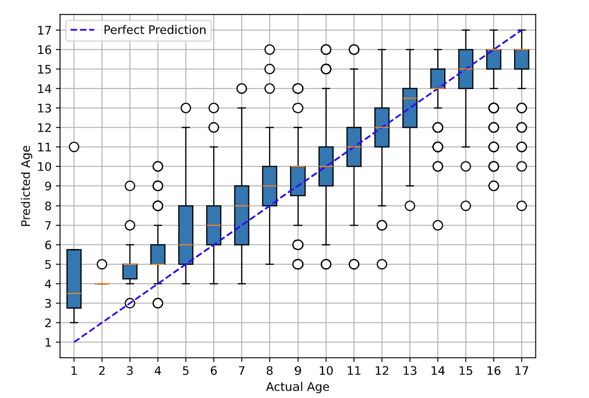
Figure 1: Actual age vs predicted age of the proposed VOLO-D1.The blue box represents the middle 50% of the predicted age distribution for a given age class. The extended lines above and below the box indicate the ranges for each 25% of the distribution (Whisker). 75% of the predicted ages fall below the upper line of the box (Third Quartile - Q3), while 25% fall below the lower line (First Quartile - Q1). Small circles represent outliers in the distribution. The orange line marks the median of the distribution.